Overview
This blog post provides insight into how Anypoint Visualizer graph is used to explore Application Network and various other metrics
Prerequisites
The following prerequisites are stated as part of this blog post:
- This post assumes that users have a basic understanding about System, Process and Experience APIs
- Below mentioned applications are just for illustration and no source code will be available for download as part of the blog
Scenario
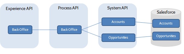
Let us consider the following applications categorized under different layers (System, Process and Experience APIs). This will provide impetus to finally visualize the application network.
Applications under each layer can be described as below:
| System APIs | Account S-API – Retrieves accounts from Salesforce Opportunities S-API – Retrieves Opportunities from Salesforce |
| Process API | Back Office P-API – Interacts with Account and Opportunities System APIs and applies some business logic to calculate the commissions |
| Experience API | Back Office E-API – Interacts with the Back Office Process API and transforms the data for consumption by other Wen/Mobile Applications |
Expected Output
Before even we start towards visualizing the graph in Anypoint Visualizer, lets look at the flow diagram of our design and finally validate if we get the same results in Anypoint Visualizer at the end-
Deployment and Configuration
Let us start with the deployment of the System APIs. (RAML design, development of application and deployment process is not in the scope of this post)
Deploy the application to CloudHub the usual way. To learn more about how to deploy applications follow the below link:
Application Deployment to CloudHub
Once the application is deployed successfully navigate to Anypoint Visualizer and select the appropriate Environment type and name where the application is deployed as shown below –
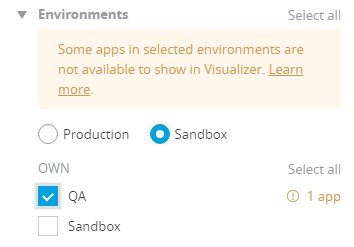
At this stage, you will notice a warning, “Some apps in selected environments are not available …“
This is due to our having not enabled monitoring for our application.
To enable monitoring, you have to navigate to Anypoint Monitoring, select “Settings“. The corresponding environment is shown via below illustration-

Post this step, choose the deployed application and enable monitoring for the same as shown in the below illustration-
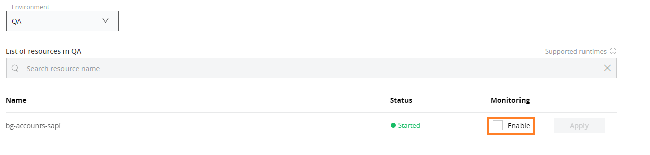
You will need to have sufficient permissions to enable the monitoring of the deployed applications.
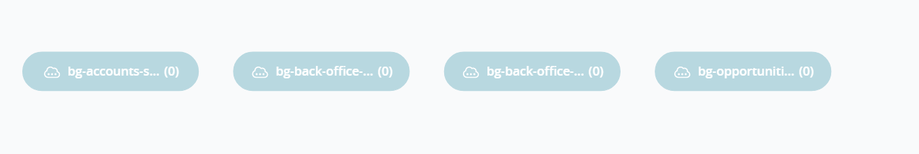
Also, the redeployment of the application can be done once monitoring is enabled. After redeployment visualizer would plot the graph –

We see a single node here as we have deployed only one application till now. Repeat the whole process of deployment for all the other 3 applications.
On the deployment of all the applications, the graph would look like –
Lets invoke the Experience API to send some traffic through all the applications. Once done, the graph will be automatically updated with all the links between the nodes and corresponding back-end calls from the System APIs.
Currently, Visualizer supports the monitoring of outbound connections on limited number of connectors.
To view, the list of supported connectors visit Supported Connectors.

This looks good, but we still do not see the layers (System, process & Experience) being displayed in the graph. To get the layers displayed in Visualizer we need to add an application property (either in any of the property files referred by the application or directly in Runtime Manager settings of the application)
anypoint.platform.visualizer.layer=LAYER_NAME
### Replace LAYER_NAME above with appropriate values like (System, Process, Experience) in respective application properties.
After addition and redeployment of “anypoint.platform.visualizer.layer” property, the final application network would resemble the below illustration –
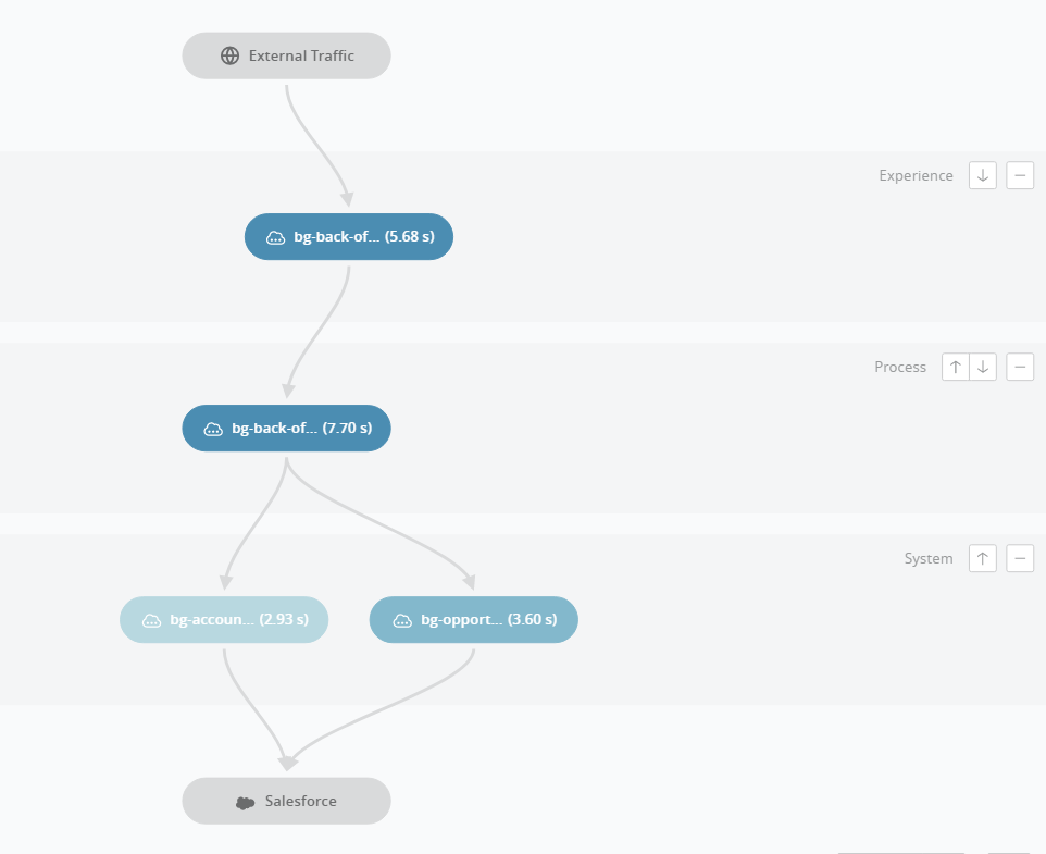
The Visualizer graph matches with our initial design/flow diagram.
One can use Visualizer to view various other metrics like –
- Average Response Time
- Average Throughput
- Failures
- Average CPU Utilization
- Average Memory Utilization
Summary
Some of the key takeaways from this article would be:
- How to use Anypoint Visualizer to visualize Application Network
- How to attach layers for each of the applications
- Various metrics that are available in Visualizer
For more information visit Anypoint Visualizer documentation.
End Note:
Hope you found this article interesting, do drop us a comment below with your inputs, views, and opinions regarding Visualize Application Network – Anypoint Visualizer
Also, if you are interested in learning more about an exciting new code quality product that reduces your Mule project costs by 79%, follow the below link :
Discover more from Integral Zone
Subscribe to get the latest posts sent to your email.


